小程序 tabBar
tabBar 是移动端应用的常见页面效果,用于实现多页面的快速切换。
在小程序中,tabBar 有两种:底部 tabBar / 顶部 tabBar。
注意
tabBar 配置时,至少 2 个,最多 5 个,且渲染顶部 tabBar 时(设置 "position": "top"),不会显示 icon,仅仅显示 text 文本。
一、全局配置
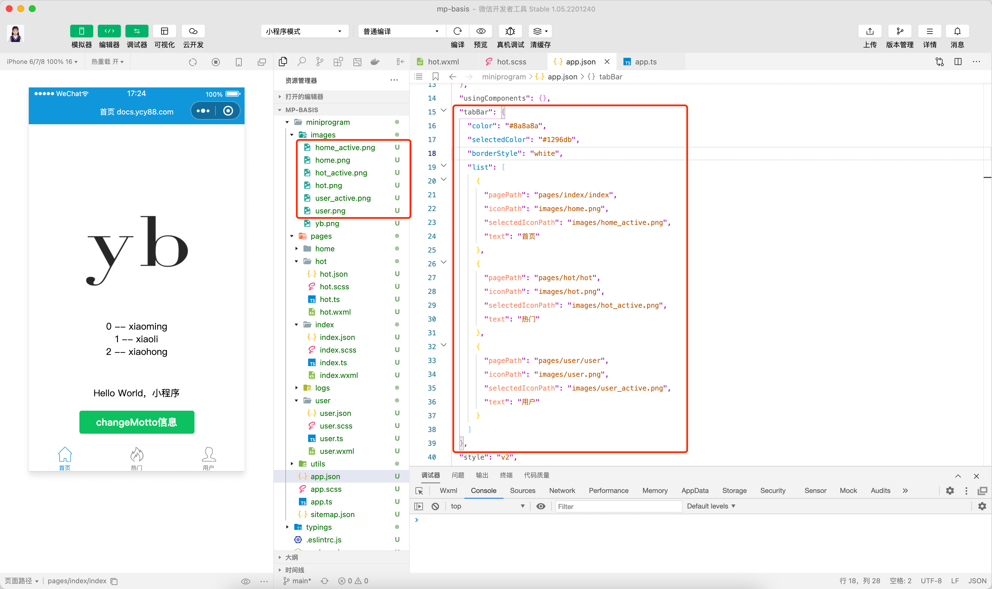
在 app.json 文件中配置如下代码:
json
"tabBar": {
    "color": "#8a8a8a",
    "selectedColor": "#1296db",
    "borderStyle": "white",
    "list": [
      {
        "pagePath": "pages/index/index",
        "iconPath": "images/home.png",
        "selectedIconPath": "images/home_active.png",
        "text": "首页"
      },
      {
        "pagePath": "pages/hot/hot",
        "iconPath": "images/hot.png",
        "selectedIconPath": "images/hot_active.png",
        "text": "热门"
      },
      {
        "pagePath": "pages/user/user",
        "iconPath": "images/user.png",
        "selectedIconPath": "images/user_active.png",
        "text": "用户"
      }
    ]
},或在 app.ts 中设置全局的 tabBar 样式(优先级更高)
ts
// app.ts
App<IAppOption>({
  onLaunch() {
    // 设置全局的 tabBar 样式
    wx.setTabBarStyle({
      color: '#8a8a8a',
      selectedColor: '#1296db',
      borderStyle: 'white'
    })

    // ... 省略
  }
  // ... 省略
})二、新增图标
在 images 目录下新增几个 tabBar 相关的图标(默认图标和选中样式图标)。
- home.png / home_active.png
- hot.png / hot_active.png
- user.png / user_active.png
三、DEMO 截图
如果要自定义 tabBar,可以参考小程序官网提供的方法:自定义 tabBar